A high-dimensional dataset is a dataset that has a large number of columns (or variables). Such a data set presents many challenges math or computers. The goal is to reduce the dimensions with dimension reduction techniques.

Contents
TogglePCA-based dimension reduction techniques
The good news is that variables (or so-called features) are often correlated – high-dimensional data is "superficially" dominated by a small number of simple variables.
We can find a subset of variables to represent the same level of information in the data or transform the variables into a new set of variables without losing much information. Although high-power computing can somehow handle high-dimensional data, in many applications there is still a need to reduce the dimensionality of the original data.
Principal component analysis (PCA) is probably the most popular technique when thinking about dimension reduction. In this article, I will start with PCA and then introduce other dimension reduction techniques. Python code will be included in each technique.
Data scientists can use dimension reduction techniques to identify anomalies. Why? Don't we just want to reduce dimensionality? The intuition lies in the outliers themselves. DMHawkins said: “An outlier is an observation that deviates so much from other observations that it raises suspicion that it was generated by a different mechanism. Once the dimensions are reduced to fewer main dimensions, the patterns are identified and then the outliers are revealed.
Principal component analysis PCA
The idea of principal component analysis (PCA) is to reduce the dimensionality of a data set consisting of a large number of related variables while retaining as much variance in the data as possible. PCA finds a set of new variables whose original variables are only their linear combinations. The new variables are called principal components (PC). These principal components are orthogonal: in a 3D case, the principal components are perpendicular to each other. X cannot be represented by Y or Y cannot be represented by Z.
The following figure shows the intuition of PCA: it “rotates” the axes to better align with your data. The first principal component will capture most of the variance in the data, followed by the second, third, and so on. Therefore, the new data will have fewer dimensions.

Let's use the iris dataset to illustrate PCA:
# Use the iris dataset to illustrate PCA:
import pandas as pd
url = “https://archive.ics.uci.edu/ml/machine-learning-databases/iris/iris.data"
# load dataset into Pandas DataFrame
df = pd.read_csv(url, names=['sepal length','sepal width','petal length','petal width','target'])
df.head()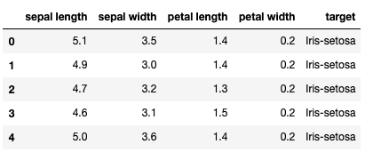
Note that this IRIS dataset comes with the target variable. In PCA you only transform the X variables without the target Y variable.
All variables must be on the same scale before applying PCA, otherwise a feature with large values will dominate the result.
Below I am using StandardScaler in scikit-learn to standardize dataset features on unit scale (mean=0 and variance=1).
from sklearn.preprocessing import StandardScaler
variables = ['sepal length', 'sepal width', 'petal length', 'petal width']
x = df.loc[:, variables].values
y = df.loc[:,['target']].values
x = StandardScaler().fit_transform(x)
x = pd.DataFrame(x)
There are four characteristics in the original data. PCA will therefore supply the same number of main components.
from sklearn.decomposition import PCA
pca = pca()
x_pca = pca.fit_transform(x)
x_pca = pd.DataFrame(x_pca)
x_pca.head()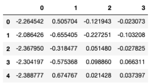
What are the variances explained by each of the principal components? Use pca.explained_variance_ratio_ to return a vector of the variance:
explained_variance = pca.explained_variance_ratio_
explained_variancearray([0.72770452, 0.23030523, 0.03683832, 0.00515193])
It shows that the first principal component represents a variance of 72.22 %, the second, third and fourth represent a variance of 23.9 %, 3.68 % and 0.51 % respectively. We can say that 72.22 + 23.9 = 96.21% of information is captured by the first and second principal components.
We often want to keep only the meaningful features and remove the insignificant ones. A rule of thumb is to keep the major principal components that capture large variance and ignore the small ones.
We can plot the results using the first two components. Let's add the target variable y to the new x_pca data:
x_pca['target']=y
x_pca.columns = ['PC1','PC2','PC3','PC4','target']
x_pca.head()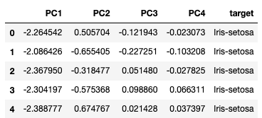
The result shows that the data is separable in the new space.
import matplotlib.pyplot as plt
fig = plt. figure()
ax = fig.add_subplot(1,1,1)
ax.set_xlabel('Main Component 1')
ax.set_ylabel('Main Component 2')
ax.set_title('2 component PCA')
targets = ['Iris-setosa', 'Iris-versicolor', 'Iris-virginica']
colors = ['r', 'g', 'b']
for target, color in zip(targets, colors):
 indicesToKeep = x_pca['target'] == target
 ax.scatter(x_pca.loc[indicesToKeep, 'PC1']
 , x_pca.loc[indicesToKeep, 'PC2']
 , c = color
 , s = 50)
ax.legend(targets)
ax.grid()
How do we use PCA to detect outliers? Let me give you the intuition. After the transformation, the "normal" data points will align along the eigenvectors (new axes) with small eigenvalues. Outliers are far from eigenvectors with large eigenvalues. Therefore, the distances between each data point and the eigenvectors become a measure of the outlier. A large distance indicates an anomaly.
Kernel ACP (KPCA)
PCA applies the linear transformation, which is only its limitation. KACP extends PCA to nonlinearity. It first maps the original data onto a (usually higher-dimensional) nonlinear feature space, and then applies PCA to extract the principal components from that space. This can be understood by figure (B). The graph on the left shows that the blue and red points cannot be separated using a linear transformation. But if all the points are projected onto 3D space, the result becomes linearly separable! We then apply PCA to separate the components.
Where does intuition come from? Why does the separation of components become easier in a higher dimensional space? This must go back to the Vapnik-Chervonenkis (VC) theory. He says mapping in a higher-dimensional space often provides greater classification power.

The following Python code creates a circular path consisting of red and blue dots. Obviously there is no way to separate the red and blue dots with a line (linear separation).
print(__doc__)
import numpy as np
import matplotlib.pyplot as plt
from sklearn.decomposition import PCA, KernelPCA
from sklearn.datasets import make_circlesnp.random.seed(0)
x, y = make_circles(n_samples=400, factor=.3, noise=.05)plt.figure(figsize=(10,10))
plt.subplot(2, 2, 1, aspect='equal')
plt.title("Original space")
reds = y == 0
blues = y == 1plt.scatter(X[reds, 0], X[reds, 1], c="red",s=20, edgecolor='k')
plt.scatter(X[blues, 0], X[blues, 1], c="blue",s=20, edgecolor='k')
plt.xlabel("$x_1$")
plt.ylabel("$x_2$")
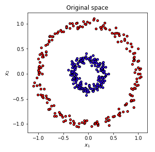
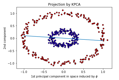
However, when we project the circle into a higher dimensional space and separate using PCA, the data observations with respect to the first and second principal components are separable! Below is the result that the points are plotted against the first and second principal components. I draw a line to separate the red and blue dots.
In KernelPCA, we specify kernel='rbf', which is the radial basis function, or Euclidean distance. RBFs are commonly used as the core in machine learning techniques such as support vector machine (SVM).
kpca = KernelPCA(kernel=”rbf”, fit_inverse_transform=True, gamma=10)
X_kpca = kpca.fit_transform(X)
pca = pca()
X_pca = pca.fit_transform(X)plt.scatter(X_kpca[reds, 0], X_kpca[reds, 1], c=”red”,s=20, edgecolor='k')
plt.scatter(X_kpca[blues, 0], X_kpca[blues, 1], c=”blue”,s=20, edgecolor='k')
x = np.linspace(-1, 1, 1000)
plt.plot(x, -0.1*x, linestyle='solid')
plt.title(“Projection by KPCA”)
plt.xlabel(r”1st principal component in space induced by $\phi$”)
plt.ylabel(“2nd component”)

If we specify that the kernel is 'linear' like the code below (KernelPCA(kernel='linear'), it becomes the standard PCA with only a linear transformation, and the red and blue points are not separable.
kpca = KernelPCA(kernel=”linear”, fit_inverse_transform=True, gamma=10)
X_kpca = kpca.fit_transform(X)
pca = pca()
X_pca = pca.fit_transform(X)plt.scatter(X_kpca[reds, 0], X_kpca[reds, 1], c=”red”,s=20, edgecolor='k')
plt.scatter(X_kpca[blues, 0], X_kpca[blues, 1], c=”blue”,s=20, edgecolor='k')
x = np.linspace(-1, 1, 1000)
plt.plot(x, -0.1*x, linestyle='solid')
plt.title(“Projection by KPCA”)
plt.xlabel(r”1st principal component in space induced by $\phi$”)
plt.ylabel(“2nd component”)
Linear Discriminant Analysis LDA
The origin of LDA is different from PCA. PCA is an unsupervised learning method that transforms original functionality into a set of new functionality. We do not care whether the new feature set can provide the best discriminating power for the target variable. In contrast, Linear Discriminant Analysis (LDA) seeks to preserve as much discriminating power as possible for the dependent variable, while projecting the original data matrix onto a lower-dimensional space.
LDA is a type of supervised learning technique. It uses the classes of the dependent variable to divide the space of predictors into regions. All regions should have linear boundaries. Where the name linear comes from. The model predicts that all observations in a region belong to the same class of the dependent variable.
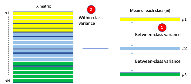
LDA achieves the above goal in three main steps. First, it calculates the separability between the different classes of the dependent variable, called the between-class variance, as shown in (1) of Figure LDA. Second, it calculates the distance between the mean and the samples of each class, called within-class variance, as shown in (2). Then, it constructs the lower-dimensional space with this criterion: maximizing the inter-class variance and minimizing the intra-class variance.
The solution to this criterion is to calculate the eigenvalues and the eigenvectors. The resulting eigenvectors represent the directions of the new space and the corresponding eigenvalues represent the length of the eigenvectors. Thus, each eigenvector represents an axis of LDA space, and the eigenvalue represents the length of this eigenvector.
I will be using the “Red Wine Quality” dataset for the Kaggle contest. This data set has 11 input variables and one “quality” output variable.
import matplotlib.pyplot as plt
from sklearn.decomposition import PCA
from sklearn.discriminant_analysis import LinearDiscriminantAnalysis
wine = pd.read_csv('winequality-red.csv')
wine.head()
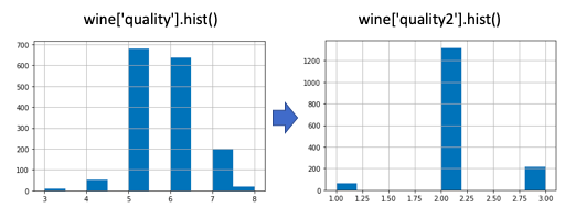
For simplicity, I group the output variable into three values. wine['quality2'] = np.where(wine['quality']<=4,1, np.where(wine['quality']<=6,2,3)).
The following code executes PCA and LDA.
X = wine.drop(columns=['quality','quality2'])
y = wine['quality2']
target_names = np.unique(y)
target_namespca = PCA(n_components=2)
X_r = pca.fit(X).transform(X)lda = LinearDiscriminantAnalysis(n_components=2)
X_r2 = lda.fit(X, y).transform(X)
Next, plot the results of PCA and LDA:
# Percentage of variance explained for each component
print('explained variance ratio (first two components): %s'
 % str(pca.explained_variance_ratio_))plt.figure()
colors = ['navy', 'turquoise', 'darkorange']
lw = 2for color, i, target_name in zip(colors, target_names, target_names):
 plt.scatter(X_r[y == i, 0], X_r[y == i, 1], color=color, alpha=.8, lw=lw,
 label=target_name)
plt.legend(loc='best', shadow=False, scatterpoints=1)
plt.title('PCA of WINE dataset')plt.figure()
for color, i, target_name in zip(colors, target_names, target_names):
 plt.scatter(X_r2[y == i, 0], X_r2[y == i, 1], alpha=.8, color=color,
 label=target_name)
plt.legend(loc='best', shadow=False, scatterpoints=1)
plt.title('LDA of WINE dataset')plt.show()

LDA is suitable for a multi-class classification problem.
Singular Value Decomposition SVD
SVD is a data synthesis method similar to PCA. It extracts important features from the data. But there is another advantage of SVD: rebuilding the original dataset into a small dataset. So it has wide applications such as image compression. For example, if you have an image 32*32 = 1024 pixels, SVD can summarize it into 66 pixels. The 66 pixels can recover 32*32 pixels images without missing any important information.
SVD was instrumental in linear algebra, but it seems "not as famous as it should be" as stated in the classic textbook "Linear Algebra and Its Applications" by Gilbert Strang. To properly introduce SVD, it is essential to start with the matrix operation. If A is a symmetric n × n real matrix, there exists an orthogonal matrix V and a diagonal D such that

The columns V are eigenvectors for A, and the diagonal entries of D are the eigenvalues of A. This process is called eigenvalue decomposition, or EVD, for the matrix A. It tells us how to choose orthonormal bases of so that the transformation is represented by a matrix. with the simplest possible shape, that is to say diagonally. (For readers who want to review the steps for diagonalizing a matrix, here's a good example.) The term orthonormal means that two vectors are orthogonal or perpendicular.
By extending the symmetric matrix, the SVD works with any real m×n matrix A. Given a real m×n matrix A, there exists an m×m orthogonal matrix U, an m×m orthogonal matrix V, and an m×n diagonal matrix Σ such that

Note that an orthogonal matrix is a square matrix such that the product of itself and its inverse matrix is an identity matrix. A diagonal matrix is a matrix in which the entries other than the diagonal are all zero.
Below I will use the iris dataset again to show you how to apply SVD.
from numpy import *
import operator
import matplotlib.pyplot as plt
import pandas as pd
from numpy.linalg import *url = “https://archive.ics.uci.edu/ml/machine-learning-databases/iris/iris.data"
# load dataset into Pandas DataFrame
df = pd.read_csv(url, names=['sepal length','sepal width','petal length','petal width','target'])# Only the X variables
data = df[['sepal length','sepal width','petal length','petal width']]#calculate SVD
n = 2 # We will take two Singular Values
U, s, V = linalg.svd(data)# eye() creates a matrix with ones on the diagonal and zeros elsewhere
Sig = mat(eye(n)*s[:n])
newdata = U[:,:n]
newdata = pd.DataFrame(newdata)
newdata.columns=['SVD1','SVD2']
newdata.head()
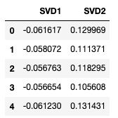
You can compare the result of SVD with that of PCA. Both get similar results.
# Add the actual target to the data in order to plot it
newdata['target']=df['target']fig = plt. figure()
ax = fig.add_subplot(1,1,1)
ax.set_xlabel('SVD 1')
ax.set_ylabel('SVD 2')
ax.set_title('SVD')
targets = ['Iris-setosa', 'Iris-versicolor', 'Iris-virginica']
colors = ['r', 'g', 'b']
for target, color in zip(targets, colors):
 indicesToKeep = newdata['target'] == target
 ax.scatter(newdata.loc[indicesToKeep, 'SVD1']
 , newdata.loc[indicesToKeep, 'SVD2']
 , c = color
 , s = 50)
ax.legend(targets)
ax.grid()

Embedding of the t-distributed stochastic neighbor (t-SNE)
t-SNE is developed by Laurens van der Maaten and Geoggrey Hinton. This is a algorithm machine learning tool for visualization that features the integration of high-dimensional data into a two- or three-dimensional low-dimensional space.
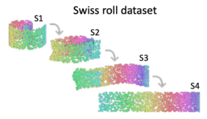
What is the best way to present the three-dimensional Swiss roll above in two-dimensional? Intuitively, we want to “unroll” the Swiss roll into a flat cake. In mathematics, this means that similar points will become near points and dissimilar points will become distant points.
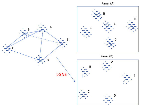
The following figure shows another example. It is a three-dimensional tetrahedron with data points clustered at the corners of the vertices. If we just reduce the three-dimensional graph to a two-dimensional graph like panel (A) does, it doesn't work well because group (A) becomes the central cluster. In contrast, panel (B) is probably a better 2D exposure that preserves the far distances between the group (A)–(E) while maintaining the local distances of the points in each group. t-SNE, a nonlinear dimension reduction technique, is designed to preserve local neighborhoods. If a set of points cluster together on a t-SNE plot, we can be fairly certain that these points are close to each other.
t-SNE models similarities between points. How does he define similarities? First, it is defined by the Euclidean distance between the point Xi and Xj. Second, it is defined as the conditional probability that “the similarity of data point i to point j is the conditional probability p that point i would choose data j as its neighbor if other neighbors were selected based on their probabilities under a Gaussian distribution. In the following conditional expression, if point j is closer to point i than other points, it has a higher probability (note the negative sign) of being chosen.

t-SNE aims to match the above conditional probability p between j and i as well as possible by a low-dimensional space q between the point Yi and Yj, as shown below. The probability q follows a fat-tailed Student-t distribution, where the “t” in t-SNE comes from.

The next step is to find Yi so that the q-distribution approximates the p-distribution as closely as possible. t-SNE uses gradient descent, an optimization technique, to find the values.
Below I show how the t-SNE technique is used with the iris dataset.
from sklearn.manifold import TSNE
from sklearn.datasets import load_iris
from sklearn.decomposition import PCA
import matplotlib.pyplot as plt
iris = load_iris()
X_tsne = TSNE(learning_rate=100).fit_transform(iris.data)
X_pca = PCA().fit_transform(iris.data)
plt. figure(figsize=(10, 5))
plt.subplot(121)
plt.scatter(X_tsne[:, 0], X_tsne[:, 1], c=iris.target)
plt.subplot(122)
plt.scatter(X_pca[:, 0], X_pca[:, 1], c=iris.target)
