After making a descriptive analysis data, fill in the blanks and select the first columns. It is important to continue to reduce dimensions, for this, this tutorial on t-SNE presents dimension reduction by nonlinear analysis.

Contents
ToggleTutorial on t-SNE and nonlinear dimension reduction
Most real-world datasets have many features, sometimes several thousand. Each of them can be thought of as a dimension in the space of data points. Therefore, most often we deal with high-dimensional datasets, where complete visualization is quite difficult.
To look at a data set as a whole, we need to reduce the number of dimensions used in the visualization without losing a lot of information about the data. This task is called dimensionality reduction and is an example of an unsupervised learning problem because we have to derive new low-dimensional features from the data itself, without any supervised input.
One of the well-known methods of dimensionality reduction is principal component analysis (PCA), which we will explore later in this course. Its limitation is that it is a algorithm linear which implies some restrictions on the data.
There are also many nonlinear methods, collectively called Manifold Learning. One of the best known of them is the t-SNE, hence this t-SNE tutorial 🙂
The name of the method sounds complex and a bit intimidating: t-distributed Stohastic Neighbor Embedding. His math are also impressive (we won't dwell on that here, but, if you're feeling brave, here's the original article by Laurens van der Maaten and Geoffrey Hinton of JMLR).
Its basic idea is simple: find a projection for a high-dimensional feature space onto a plane (or a 3D hyperplane, but it is almost always 2D) such that the points that were far apart in the initial space at n dimensions will end far apart in the plane. Those who were originally close will remain close to each other.
Essentially, neighbor embedding is a search for a new, less-dimensional data representation that preserves the neighborhood of examples.
Representation of t-SNE
Now let's practice a bit. First, we need to import additional classes:
from sklearn.manifold import TSNE
from sklearn.preprocessing import StandardScaler
We'll leave out the State and Churn features and convert the "Yes"/"No" values from binary features to numeric values using pandas.Series.map():
X = df.drop(['Churn', 'State'], axis=1)
X['International plan'] = X['International plan'].
                          map({'Yes': 1, 'No': 0})
X['Voice mail plan'] = X['Voice mail plan'].
                       map({'Yes': 1, 'No': 0})
We also need to normalize the data. To do this, we will subtract the mean of each variable and divide it by its standard deviation. All of this can be done with StandardScaler.
scaler = StandardScaler()
X_scaled = scaler.fit_transform(X)
Let us now construct a t-SNE representation:
%%time tsne = TSNE(random_state=17)
tsne_repr = tsne.fit_transform(X_scaled)CPU times: user 1min 32s, sys: 7.86s, total: 1min 39s
Wall time: 1min 39s
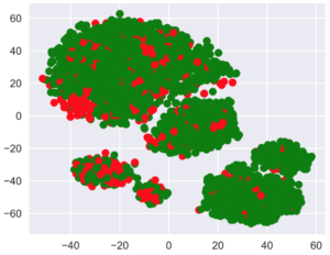
Let's color this t-SNE representation according to the churn (green for loyal customers, and red for those who have left).
pls.scatter(tsne_repr[:, 0], tsne_repr[:, 1],
            c=df['Churn'].map({False: 'green', True: 'red'}));
We can see that the customers who turned away are concentrated in a few areas of the lower-dimensional feature space.
Multi t-SNE
To better understand the image, we can also color it with the remaining binary features: International Plan and Voicemail. Green dots here indicate objects that are positive for the corresponding binary characteristic.
_, axes = plt.subplots(1, 2, sharey=True, figsize=(12, 5))for i, name in enumerate(['International plan', 'Voice mail plan']):
    axes[i].scatter(tsne_repr[:, 0], tsne_repr[:, 1],
                    c=df[name].map({'Yes': 'green', 'No': 'red'}))
    axes[i].set_title(name)

However, it is clear that, for example, many dissatisfied customers who have canceled their subscription are crowded into the most south-western cluster which represents people with the international plan but no voicemail.
Disadvantages of t-SNE
Finally, let's note some disadvantages in this t-SNE tutorial:
Big complexity Calculation. The implementation in scikit-learn is unlikely to be feasible in a real task. If you have a large number of samples, you should try Multicore-TSNE instead.
The plot can change a lot depending on the random seed, which complicates the interpretation. Here is a good tutorial on t-SNE. In general, you should not draw far-reaching conclusions based on such graphs, as it may amount to mere guesses. Of course, some findings in t-SNE images may inspire an idea and be confirmed by further research down the line, but that doesn't happen very often.
