Exploratory data analysis (EDA) is an essential first step in most data science projects and often involves following the same steps to characterize a data set (e.g., finding data types, missing information , distribution of values, correlations, etc.). One of the latest is a new open-source Python library called Sweetviz.

Contents
ToggleInstallation and launch of Sweetviz
After installing Sweetviz (using pip install sweetviz), simply load the pandas dataframes as you normally would, then call analyze(), compare() or compare_intra().
import sweet viz
import pandas as pd
train = pd.read_csv("train.csv")
test = pd.read_csv("test.csv")
We now have 2 dataframes (train and test), and we would like to analyze the “Survived” target value. I want to point out that in this case we know the name of the target column in advance, but specifying a target column is still optional. We can generate a report with this line of code:
my_report = sweetviz.compare([train, "Train"], [test, "Test"], "Survived")Running this command will perform the analysis and create the report object. To get the result, just use the show_html() command:
my_report.show_html("Report.html") # Not providing a filename will default to SWEETVIZ_REPORT.htmlOverall Summary
The summary shows us the characteristics of the two dataframes side by side. We can immediately identify that the test set is roughly half the size of the training set, but contains the same functionality. This legend at the bottom shows us that the training set contains the target variable "Survived", but the test set does not.
Note that Sweetviz will make a best estimate to determine the data type of each column, between numeric, category/boolean and text.

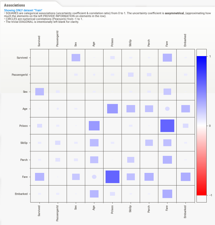
Associations
This graph is a composite of visuals from Drazen Zaric: Better Heatmaps and Correlation Matrix Plots in Python and concepts from Shaked Zychlinski: The Search for Categorical Correlation.
Basically, in addition to showing the traditional numerical correlations, it unifies in a single graph both the correlation numerical but also the uncertainty coefficient (for categorical-categorical) and the correlation ratio (for categorial-numerical). The squares represent the variables linked to the categorical characteristics and the circles represent the numerical-numerical correlations. Note that the trivial diagonal is left blank, for clarity.
Categorical-categorical associations (provided by the uncertainty coefficient) are ASYMMETRIC, which means that each row represents how much the row title (left) gives information about each column. For example, "Sex", "Pclass" and "Fare" are the elements that give the most information about "Survived". For the Titanic dataset, this information is rather symmetric but this is not always the case.
Finally, it is worth noting these correlation/association methods
should not be taken as gospel as they make assumptions about the underlying distribution of data and relationships. However, they can be a very useful starting point.

Selecting a variable
When a target variable is specified, it will appear first, in a special black box. Only numeric and Boolean entities can currently be targets.
We can deduce from this summary that "Survived" has no missing data in the training set (891, 100%), that there are 2 distinct possible values (representing less than 1% of all values), and from the graph it can be estimated that about 60 %s did not survive.
Qualitative and Boolean data
When you move the mouse over one of the variables, a box to the right will display the details. The content of the details depends on the type of variable analyzed. In the case of a categorical (or Boolean) variable, as is the case with the target, the analysis is as follows:

Here we can see the exact statistics for each class, where 62% did not survive and 38% survived. You also get the detail of the associations for each of the other features.
Quantitative data
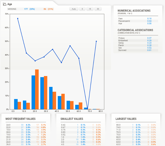
Numerical data shows more information about its summary. Here we can see that in this case about 20 % of the data is missing (21 % in the test data, which is very consistent).

Note that the target value ("Survived" in this case) is plotted as a line, just above the distribution graph. This allows instant analysis of the target distribution relative to other variables.
Interestingly, we can see from the graph on the right that the survival rate is quite constant at all ages, except for the youngest who have a higher survival rate. It would seem that “women and children first” are not just words.
Details of a quantitative variable
As with the categorical data type, the numeric data type displays additional information in its detail area. It is worth noting here the buttons at the top of the graph.
These buttons change the number of “bins” displayed in the graph. You can select from the following: Auto, 5, 15, 30.
To access these buttons, you must "lock in place" the current functionality by clicking on them. The function then has a RED OUTLINE to show that it is locked in place and you can access the detail area.

Text data
For now, anything that the system does not consider numeric or categorical will be considered "text". Text features currently only show the number (percentage) as statistics.

Comparison of subpopulations
Even if you are looking at only one dataset, it can be very useful to study the characteristics of different subpopulations within that dataset.
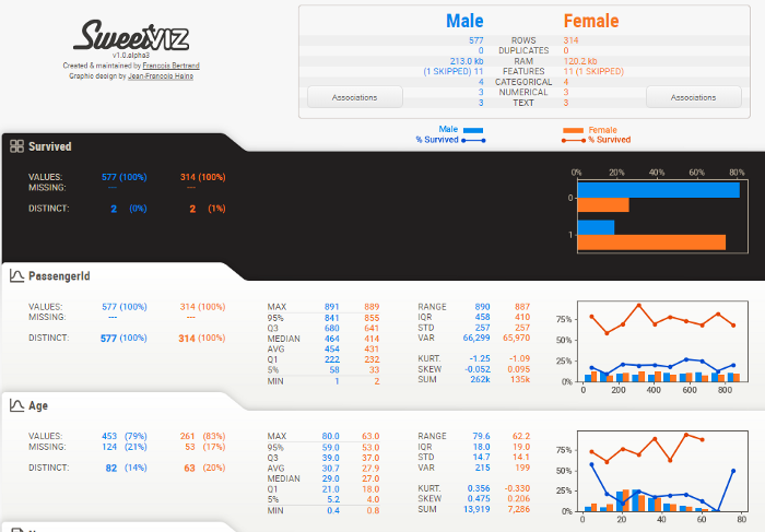
For this, Sweetviz offers the compare_intra() function. To use it, you supply a boolean test that splits the population (here we try train["Sex"] == 'male', to get an idea of the different gender populations), and give each sub- population. For example:
my_report = sweetviz.compare_intra(train, train["Sex"] == 'male', ["Male", "Female"], 'Survived')my_report.show_html() # Not providing a filename will default to SWEETVIZ_REPORT.html
This gives the following analysis:

Note that the target value ("Survived" in this case) is now plotted as separate lines, one for each set of data being compared (e.g. male in blue, female in orange).
Example on the Titanic dataset
PassengerId

- The distribution of ID and survivability is uniform and orderly.
- No missing data
Sex

- Twice as many men as women
- Women survive 30% better than men
- Same distributions in training and test sets
- No missing data
Age

- 20 % of missing data, consistent missing data and distribution between Train and Test
- Population centered on young adults, but ages 0 to 70 are well represented
- Survivability surprisingly evenly distributed, except for a peak at younger ages
- Age seems tied to Siblings, Pclass, and Fare, and a bit more surprising to Embarked
Name

- No missing data
- All names are distinct
Pclass

- Survivability closely follows class (first class most likely to survive, third class least likely)
- Similar distribution between Train and Test
- No missing data
SibSp

- There seems to be a survivability peak at 1 and to some extent at 2, but (looking at the details pane not shown here) there is a steep dip at 3 and up. Large families could not do it or were perhaps poorer?
park

- Similar Cast
- No missing data
Ticket
- ~80 % of distinct values, i.e. approximately 1 in 5 shared tickets on average
- The highest frequency ticket was 7, which is generally consistent with the maximum number of siblings (8)
- No missing data, data looks pretty clean
Fare

- As expected, and similar to Pclass, the higher tariffs survived better (although the sample size gets quite thin at higher levels)
- A correlation ratio of 0.26 for “Survived” is relatively high, so it would tend to support this theory
- About 30 % of distinct values seems a little high as you would expect less fixed prices, but there seems to be a lot of granularity, so that's fine
- Only 1 record missing in test set, fairly consistent data between Train and Test
Cabin

- 78% missing data
- The maximum frequency is 4, which would make sense to have 4 people maximum in a cabin
Embedded

- 3 distinct values (S, C, Q)
- Slightly higher survivability at C; could this be a place with richer people?
- Anyway, "Embedded" shows an uncertainty coefficient of only 0.03 for "Survived", so it may not be very significant
General analysis
- Overall, most of the data is there and seems consistent and logical; no major outliers or huge surprises
Test versus Training data
The test contains about 50 % fewer lines.
Train and Test are very close in the distribution of missing data.
Training and test data values are very consistent across the board
Association/correlation analysis
- Gender, fare, and class give the most information about survivors
- As expected, Fare and Pclass are highly correlated
- Age seems to tell us a lot about Pclass, siblings and to some extent Fare, which would be somewhat expected. It seems to tell us a lot about "Embedded" which is a bit more surprising.
missing data
- There are no significant missing data except for age (~20 %) and cabin (~77 %)
