Contents
ToggleAnomaly detection in time series
This tutorial addresses the problem of detecting anomalies in preprocessing for time series forecasting.

context
During the'data analysis time series, we need to check for outliers, just like we do for static data. If you've worked with data in any capacity, you know how painful outliers are for an analyst. These outliers are called “anomals” in time series jargon.
The code from Aayush Bajaj, who created this tutorial, is available: PIPELINE
From a traditional perspective, an outlier/anomaly is:
“An observation that deviates so much from other observations that it raises suspicion that it was generated by a different mechanism. »
Therefore, you can think of outliers as observations that do not follow expected behavior.
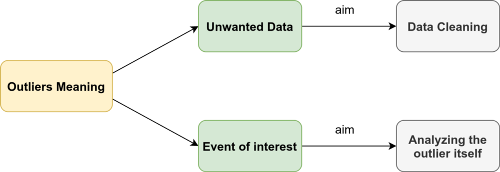
As shown in the figure above, outliers in time series can have two different meanings. The semantic distinction between them mainly relies on your interest as an analyst or the particular scenario.
These observations have been linked to noise, erroneous or unwanted data, which in itself is of no interest to the analyst. In these cases, outliers should be removed or corrected to improve data quality and generate a cleaner dataset that can be used by other data mining algorithms. For example, sensor transmission errors are eliminated to obtain more accurate predictions, because the main goal is to make predictions.
Nevertheless, in recent years – especially in the field of time series data – many researchers have strived to detect and analyze unusual but interesting phenomena. Fraud detection is a good example: the main goal is to detect and analyze the outlier itself. These observations are often called anomalies.
The anomaly detection problem for time series is typically formulated as the identification of data points that are outliers relative to a norm or usual signal. Take a look at some types of outliers:

Point Outlier
A point outlier is data that behaves unusually in a specific temporal instance compared to other values in the time series (global outlier) or to its neighboring points (local outlier).
Point outliers can be univariate or multivariate, depending on whether they affect one or more time-dependent variables, respectively.
The figure contains two univariate point outliers, O1 and O2, while the multivariate time series is composed of three variables and has univariate (O3) and multivariate (O1 and O2) point outliers.
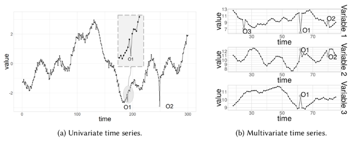
We'll look at univariate outliers in more detail in the Anomaly Detection section.
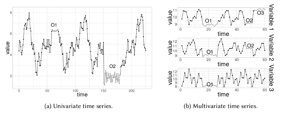
Outlier subsequence
This means consecutive points in time whose joint behavior is unusual, although each observation taken individually is not necessarily an outlier. Subsequence outliers can also be global or local and can affect one (univariate subsequence outlier) or several (multivariate subsequence outliers) time-dependent variables.
Decomposition detection
STL stands for LOESS-based seasonal trend decomposition procedure. This technique gives you the ability to divide your time series signal into three parts: seasonal, trend, and residual.
It works for seasonal time series, which is also the most popular time series data type. To generate an STL decomposition plot, we simply use the always amazing statistics models to do the heavy lifting for us.
plt.rc('figure',figsize=(12,8)) plt.rc('make',size=15) result = seasonal_decompose(lim_catfish_sales,model='additive') fig = result.plot()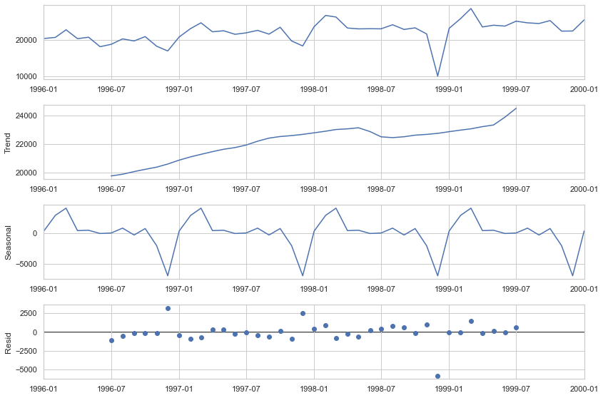
If we analyze the deviation of the residuals and introduce a threshold for it, we will obtain a algorithm anomaly detection. To implement this, we only need the data on the residuals from the decomposition.
plt.rc('figure',figsize=(12,6)) plt.rc('make',size=15) fig, ax = plt.subplots() x = result.resid.index y = result.resid.values ax.plot_date(x, y, color='black',linestyle='--') ax.annotate('Anomaly', (mdates.date2num(x[35]), y[35]), xytext=(30, 20), textcoords='offset points', color='red',arrowprops=dict(facecolor='red',arrowstyle='fancy')) fig.autofmt_xdate() plt.show()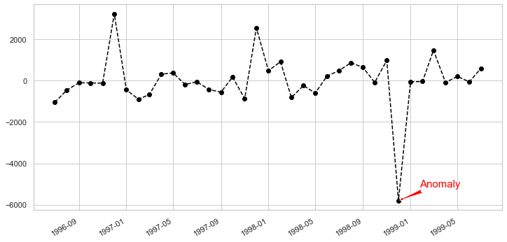
It's simple, robust, it can handle many different situations and all anomalies can always be interpreted intuitively.
The biggest disadvantage of this technique is the rigid adjustment options. Aside from the threshold and perhaps the confidence interval, there's not much you can do about this. For example, you track users of your website that was closed to the public and then suddenly opened. In this case, you should separately track anomalies that occur before and after the release periods.
Detection by regression trees
We can use the power and robustness of decision trees to identify outliers/ anomalies in time series data.
The main idea, which differs from other popular outlier detection methods, is that Isolation Forest explicitly identifies anomalies instead of profiling normal data points. Isolation Forest, like any tree ensemble method, is based on decision trees.
In other words, Isolation Forest detects anomalies solely based on the fact that the anomalies are few and different data points. Anomaly isolation is implemented without resorting to any distance or density measurements.
When applying an IsolationForest model, we set contamination = outliers_fraction, which tells the model what proportion of outliers are present in the data. This is a trial/error metric. Fit and Predict (Data) performs outlier detection on the data and returns 1 for normal, -1 for anomaly. Finally, we visualize anomalies with the Time Series view.
Let's do it step by step. First, visualize the time series data:
plt.rc('figure',figsize=(12,6)) plt.rc('make',size=15) catfish_sales.plot()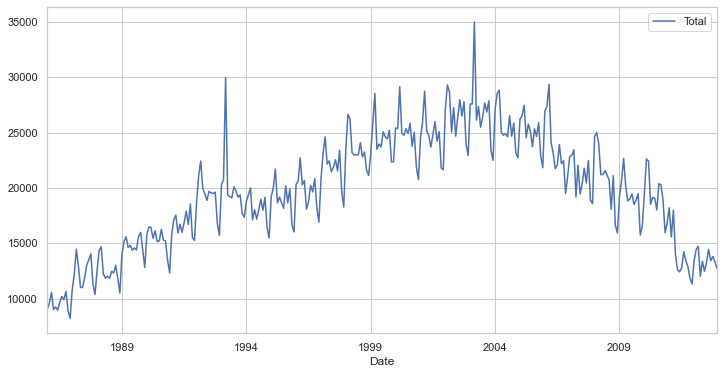
Next, we need to set some parameters like the outlier fraction and train our IsolationForest model. We can use the very useful scikit-learn to implement the Isolation Forest algorithm (see git at the top of the page).
outliers_fraction = float(.01) scaler = StandardScaler() np_scaled = scaler.fit_transform(catfish_sales.values.reshape(-1, 1)) data = pd.DataFrame(np_scaled)
# train insulation forest
model = IsolationForest(contamination=outliers_fraction) model.fit(data)catfish_sales['anomaly'] = model.predict(data)
# visualization
fig, ax = plt.subplots(figsize=(10,6)) a = catfish_sales.loc[catfish_sales['anomaly'] == -1, ['Total']] #anomaly
ax.plot(catfish_sales.index, catfish_sales['Total'], color='black', label = 'Normal') ax.scatter(a.index,a['Total'], color='red', label = 'Anomaly') plt.legend() plt.show();
As you can see, the algorithm did a very good job identifying our implanted anomalies, but it also initially labeled a few points as "outliers." This is due to two reasons:
- Initially, the algorithm is naive enough to be able to understand what constitutes an anomaly. The more data it gets, the more variance it is able to see and it adjusts itself.
- If you see a lot of true negatives, that means your contamination setting is too high. Conversely, if you don't see the red dots where they should be, the contamination setting is set too low.
The biggest advantage of this technique is that you can introduce as many random variables or features as you want to create more sophisticated models.
The weakness is that an increasing number of features can start to impact your computing performance quite quickly. In this case, you should select features carefully.
Detection by prediction
Anomaly detection using forecasting is based on an approach where multiple points in the past generate a forecast of the next point with the addition of a random variable, which is usually white noise.
As you can imagine, points predicted in the future will generate new points and so on. Its obvious effect on the forecast horizon is that the signal becomes smoother.
The difficult part of using this method is that you need to select the number of differences, number of autoregressions and forecast error coefficients. Every time you work with a new signal, you need to create a new forecast model.
Another obstacle is that your signal must remain stationary after differentiation. In simple terms, this means that your signal should not depend on time, which is an important constraint.
We can use different forecasting methods such as moving averages, autoregressive approach and ARIMA with its different variants. The anomaly detection procedure with ARIMA is as follows:
- Predict the new point from the past data and find the difference in magnitude from the training data.
- Choose a threshold and identify anomalies based on this difference threshold.
To test this technique, we'll use a popular time series module called fbprophet. This module specifically addresses stationarity and seasonality, and can be tuned with certain hyper-parameters.
from fbprophet import Prophetdef fit_predict_model(dataframe, interval_width = 0.99, changepoint_range = 0.8):
m = Prophet(daily_seasonality = False, yearly_seasonality = False, weekly_seasonality = False, seasonality_mode = 'additive', interval_width = interval_width, changepoint_range = changepoint_range) m = m.fit(dataframe) forecast = m.predict(dataframe) forecast['fact'] = dataframe['y'].reset_index(drop = True)
return forecast pred = fit_predict_model(t)Now let's define the forecast function. One important thing to note here is that fbprophet will add additional metrics as features, to better identify anomalies. For example, the predicted time series variable (by the model), the upper and lower bounds of the target time series variable, and the trend measure.
Now we need to push the pred variable to another function, which will detect anomalies based on a lower and upper limit threshold in the time series variable.
def detect_anomalies(forecast):
   forecasted = forecast[['ds','trend', 'yhat', 'yhat_lower', 'yhat_upper', 'fact']].copy() predicted['anomaly'] = 0
   forecasted.loc[forecasted['fact'] > forecasted['yhat_upper'], 'anomaly'] = 1
   forecasted.loc[forecasted['fact'] < forecasted['yhat_lower'], 'anomaly'] = -1
#anomaly importances
   forecast['importance'] = 0
   forecasted.loc[forecasted['anomaly'] ==1, 'importance'] = (forecast['fact'] - predicted['yhat_upper'])/forecast['fact'] forecasted.loc[forecasted['anomaly'] ==-1, 'importance'] = (forecast['yhat_lower'] - predicted['fact'])/forecast['fact']

   return forecasted pred = detect_ anomalies(pred)
This algorithm handles different seasonality parameters well, such as monthly or annual, and natively supports all time series metrics.
Since this technique is prediction based, it will struggle in limited data scenarios. The quality of prediction in limited data will be lower, as will the accuracy of anomaly detection.
Clustering detection
The approach is quite simple. Data instances that are not part of defined clusters can potentially be marked as anomalies.
For the sake of visualization, we will use a different dataset that corresponds to a multivariate time series with one or more temporal variables. The dataset will be a subset of the one found here (the columns/features are the same).
Description of the dataset: The data contains information on purchases and purchases as well as information on price competitiveness.
Now to deal with k-means we first need to know the number of clusters that we are going to deal with. The Elbow method works quite effectively for this.
The Elbow method is a plot of the number of clusters versus explained/objective/score variance
To implement this, we will use the K-means implementation by scikit-learn.
data = df[['price_usd', 'srch_booking_window', 'srch_saturday_night_bool']] n_cluster = range(1, 20) kmeans = [KMeans(n_clusters=i).fit(data) for i in n_cluster] scores = [kmeans[i].score(data) for i in range(len(kmeans))] fig, ax = plt.subplots(figsize=(10,6)) ax.plot(n_cluster, scores) plt.xlabel('Number of Clusters') plt.ylabel('Score') plt.title('Elbow Curve') plt.show();
From the angled curve above, we see that the graph stabilizes after 10 clusters, implying that adding additional clusters does not explain much more of the variance in our relevant variable; in this case, price_usd.
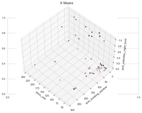
We set n_clusters = 10 and, when generating the k-means output, use the data to plot the 3D clusters.
We now need to know the number of components (functionalities) to keep.
data = df[['price_usd', 'srch_booking_window', 'srch_saturday_night_bool']] X = data.values X_std = StandardScaler().fit_transform(X)
#Calculating Eigenvecors and eigenvalues of Covariance matrix
mean_vec = np.mean(X_std, axis=0) cov_mat = np.cov(X_std.T) eig_vals, eig_vecs = np.linalg.eig(cov_mat)
# Create a list of (eigenvalue, eigenvector) tuples
eig_pairs = [ (np.abs(eig_vals[i]),eig_vecs[:,i]) for i in range(len(eig_vals))] eig_pairs.sort(key = lambda x:x[0], reverse= True)
# Calculation of Explained Variance from the eigenvalues
tot = sum(eig_vals) var_exp = [(i/tot)*100 for i in sorted(eig_vals, reverse=True)] # Individual explained variance
cum_var_exp = np.cumsum(var_exp) # Cumulative explained variance
plt.figure(figsize=(10, 5)) plt.bar(range(len(var_exp)), var_exp, alpha=0.3, align='center', label='individual explained variance', color = 'y') plt.step(range(len(cum_var_exp)), cum_var_exp, where='mid',label='cumulative explained variance') plt.ylabel('Explained variance ratio') plt.xlabel('Main components') plt.legend(loc='best') plt.show();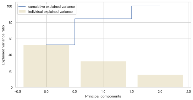
We see that the first component explains nearly 50 % of the variance. The second component explains more than 30 %. However, note that almost none of the components are truly negligible. The first 2 components contain over 80 % information. We will therefore define n_components=2.
The assumption behind anomaly detection based on clustering is that if we cluster the data, normal data will belong to clusters while anomalies will not belong to any clusters or will belong to small clusters.
We use the following steps to find and visualize anomalies:
- Calculate the distance between each point and its nearest center of gravity. Larger distances are considered anomalies.
- We use outliers_fraction to provide information to the algorithm about the proportion of outliers present in our dataset, similar to the IsolationForest algorithm. This is largely a hyperparameter that requires a hit/try or grid search to be correctly set - as a starting number, let's estimate, outliers_fraction=0.1
- Calculate number_of_outliers using outliers_fraction.
- Set the threshold as the minimum distance from these outliers.
- The result of the anomaly1 anomaly contains the above method Cluster (0: normal, 1: anomaly).
- Visualize anomalies with the cluster view.
- Visualize anomalies with the Time Series view.
# return Series of distance between each point and its distance with the closest centroid
def getDistanceByPoint(data, model):
   distance = pd.Series()
   for i in tidy(0,len(data)): Xa = np.array(data.loc[i]) Xb = model.cluster_centers_[model.labels_[i]-1] distance.at[i]=np.linalg.norm(Xa-Xb)
   return distance outliers_fraction = 0.1
# get the distance between each point and its nearest centroid. The biggest distances are considered as anomaly
distance = getDistanceByPoint(data, kmeans[9]) number_of_outliers = int(outliers_fraction*len(distance)) threshold = distance.nlargest(number_of_outliers).min()
# anomaly1 contain the anomaly result of the above method Cluster (0:normal, 1:anomaly)
df['anomaly1'] = (distance >= threshold).astype(int) fig, ax = plt.subplots(figsize=(10,6)) colors = {0:'blue', 1:'red'} ax.scatter(df['main_feature1'], df['principal_feature2'], c=df["anomaly1"].apply(lambda x: colors[x])) plt.xlabel('main feature1') plt.ylabel('main feature2') plt.show();
Now, in order to see the anomalies against real-world features, we process the data frame we created in the previous step.
df = df.sort_values('date_time') fig, ax = plt.subplots(figsize=(10,6)) a = df.loc[df['anomaly1'] == 1, ['date_time', 'price_usd']] #anomaly
ax.plot(pd.to_datetime(df['date_time']), df['price_usd'], color='k',label='Normal') ax.scatter(pd.to_datetime(a['date_time']),has['price_usd'], color='red', label='Anomaly') ax.xaxis_date() plt.xlabel('Date Time') plt.ylabel('price in USD') plt.legend() fig.autofmt_xdate() plt.show()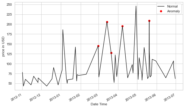
This method is able to encapsulate the peaks quite well, with a few hiccups of course. Part of the problem may be because outlier_fraction hasn't played with many values.
The biggest advantage of this technique is similar to other unsupervised techniques, that is, you can introduce as many random variables or features as you want to create more sophisticated models.
The weakness is that an increasing number of features can start to impact your computing performance quite quickly. On top of that, there are more hyper-parameters to tune and correct, so there is always a risk of high variation in model performance.
Autoencoder detection
Autoencoders are an unsupervised technique that recreates input data while extracting its features across different dimensions. So, in other words, if we use the latent representation of the data from the autoencoders, this corresponds to dimensionality reduction. Many distance-based techniques (e.g. KNNs) suffer from the curse of dimensionality when computing the distances of each data point in the full feature space. High dimensionality must be reduced.
There are many useful tools, such as principal component analysis (PCA), to detect outliers. Why do we need autoencoders? The reason is that PCA uses thealgebra linear to transform. In contrast, autoencoder techniques can perform nonlinear transformations thanks to their nonlinear activation function and multiple layers.
It is more efficient to train multiple layers with an autoencoder, rather than training a huge transformation with PCA. Autoencoder techniques thus show their merits when the data problems are complex and non-linear in nature.
We can implement autoencoders with popular frameworks like TensorFlow or Pytorch, but – for simplicity's sake – we'll use a python module called PyOD, which builds autoencoders internally using a few user inputs.
For the data part, let's use PyOD's generate_data() utility function to generate 25 variables, 500 observations, and ten percent outliers.
import numpy ace n.p.
import panda ace pd
from pyod.models.auto_encoder import AutoEncoder
from pyod.utils.data import generate_data contamination = 0.1  # percentage of outliers
n_train = 500  # number of training points
n_test = 500  # number of testing points
n_features = 25 # Number of features
X_train, y_train,1234) X_train = pd.DataFrame(X_train) X_test = pd.DataFrame(X_test)
from sklearn.preprocessing import StandardScaler X_train = StandardScaler().fit_transform(X_train)from sklearn.decomposition import PCA pca = PCA(2) x_pca = pca.fit_transform(X_train) x_pca = pd.DataFrame(x_pca) x_pca.columns=['PC1','PC2'] cdict = {0: 'red', 1: 'blue'}
# Plot
import matplotlib.pyplot ace plt plt.scatter(X_train[0], X_train[1], c=y_train, alpha=1) plt.title('Scatterplot') plt.xlabel('x') plt.ylabel('y') plt.show()
Now let's tune an autoencoder. [25, 2, 2, 25]. The input layer and the output layer each include 25 neurons. There are two hidden layers, each with two neurons.
clf = AutoEncoder(hidden_neurons =[25, 2, 2, 25]) clf.fit(X_train)Let's apply the Clf trained model to predict the anomaly score for each observation in the test data. How do you define an outlier? An outlier is a point far from other points, so the outlier score is defined by distance. The PyOD .decision_function() function calculates the distance, or anomaly score, for each data point.
# Get the outlier scores for the train data
y_train_scores = clf.decision_scores_
# Predict the anomaly scores
y_test_scores = clf.decision_function(X_test)  # outlier scores
y_test_scores = pd.Series(y_test_scores)
# Plot it!
import matplotlib.pyplot ace plt plt.hist(y_test_scores, bins='auto') plt.title(“Histogram for Model Clf1 Anomaly Scores”) plt.show()
If we use a histogram to count frequency by anomaly score, we will see that high scores correspond to low frequency — evidence of outliers. We choose 4.0 as the cutoff point and those >=4.0 as outliers.
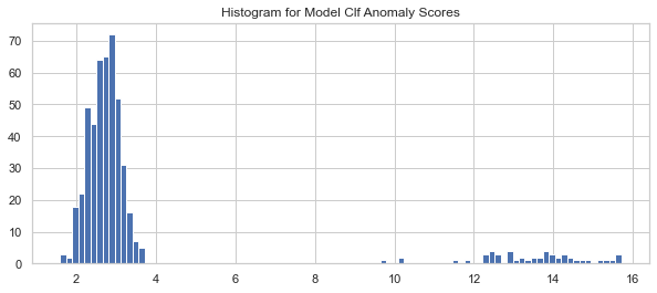
Let's assign observations with anomaly scores below 4.0 to cluster 0 and cluster 1 for those above 4.0. Let's also calculate the per-cluster summary statistics using .groupby() . This model identified 50 outliers (not shown).
df_test = X_test.copy() df_test['score'] = y_test_scores df_test['cluster'] = np.where(df_test['score']4, 0, 1) df_test['cluster'].value_counts() df_test.groupby('cluster').mean()The following result shows the average values of the variables in each cluster. The values of cluster “1” (the abnormal cluster) are very different from those of cluster “0” (the normal cluster). The “score” values show the average distance of these observations from others. A high “score” means that the observation is very far from the norm.

This way we can distinguish and label typical data and anomalies quite perfectly.
Autoencoders can easily handle large data. Regarding its nonlinearity behavior, it can find complex patterns in high-dimensional datasets.
Since this is a deep learning-based strategy, it will be particularly difficult if the data is less. Computing costs will skyrocket if network depth increases and when processing big data.
Handle anomalies with smoothing
Statistical methods allow you to adjust the value of your outlier to match the original distribution. Let's look at one of the methods used to smooth out anomalies.
The idea is to mitigate the anomaly by using data from the previous DateTime. For example, to compensate for sudden electricity consumption due to an event in your home, you can take the average of consumption during the same month for previous years.
Let's implement the same to get a clear picture. We will use the same catfish sales data that we used earlier. We can adjust with the mean using the script below.
adjusted_data = lim_catfish_sales.copy() adjusted_data.loc[curr_anomaly] = december_data[(december_data.index != curr_anomaly) & (december_data.index < test_data.index[0])].mean()plt.figure(figsize=(10,4)) plt.plot(lim_catfish_sales, color='firebrick', alpha=0.4) plt.plot(adjusted_data) plt.title('Catfish Sales in 1000s of Pounds', fontsize=20) plt.ylabel('Dirty', fontsize=16)
for year in range(start_date.year,end_date.year): plt.axvline(pd.to_datetime(str(year)+'-01-01'), color='k', linestyle='--', alpha=0.2) plt.axvline(curr_anomaly, color='k', alpha=0.7)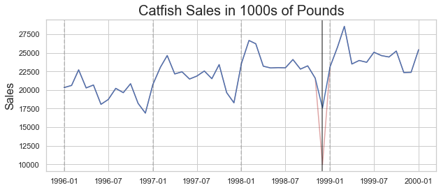
This way, you can proceed to apply forecasts or analyzes without worrying too much about the asymmetry of your results.
There are many methods for dealing with non-series data, but unfortunately they cannot be used directly in Timeseries due to the difference in the underlying structures. Non-time series processing methods involve many distribution-based methods that cannot be simply translated into Timeseries data.
Clear anomalies
The last option if neither of the two solutions above is causing debate in your solution is to remove the anomalies. This is not recommended (because you are essentially getting rid of some potentially valuable information) unless it is absolutely necessary and will not harm future analysis.
You can use .drop() functionality in pandas after identification. It will do the heavy lifting for you.
