Contents
ToggleTime diagram
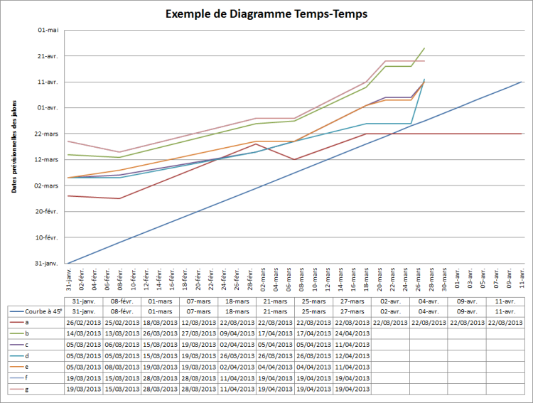
The time diagram or Curve at 45 ° is a tool for monitoring progress (deadlines and lags) used in project management. It provides information at all times on the degree of compliance with the project milestones.
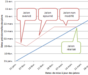
The time diagram is a graph with two axes: the x-axis corresponds to the milestone update dates, and the y-axis to the forecast dates of the milestones.
Each point on the graph represents the expected date of achievement of a milestone (Y) as it was estimated at a given point in the project (X). This graph therefore keeps the memory of the announcements of forecast dates of the milestones of a project. This is why it allows you to detect the offsets of a project.
The 45 ° curve is in fact the straight line Y = X, and corresponds to events for which the estimated date of realization or completion (Y) and that of the day on which it is revised (X) are identical (that the milestone is achieved / completed or not).
The 45 ° curve models the present over time, since it is the separation between future milestones (upper part of the graph) and completed or achieved milestones (having reached the 45 ° curve).

Graphic interpretation


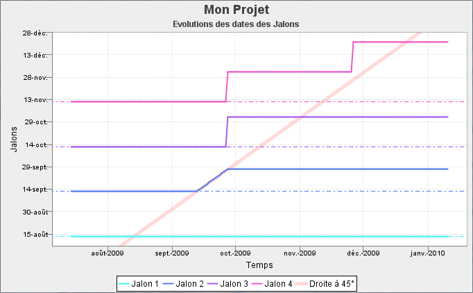
the Milestone 1 corresponds to ideal case without re-planning or delay, gives a simple straight line.
the Milestone 2 corresponds to the case where there has been a 15 days delay (September 29 instead of September 14). The curve slides to the right at 45 ° until the fence of the milestone.
the Milestone 3 shows the case where there has been a rescheduling (following the delay on milestone 2)
the Milestone 4 shows the case of 2 successive rescheduling 2 months apart.
